Most of my collage ingredients come from materials that are fairly small in scale—magazines, mail, household packaging. I've always been most interested in the abstract portions that I can harvest from those materials, so the fragments that I actually use in my work often become quite small.
In an effort to create larger works, over the years I’ve made multiple small pieces to display as a larger piece of art. This started with my Ruminations series in 2009, works on wood panels, hung in a grid.
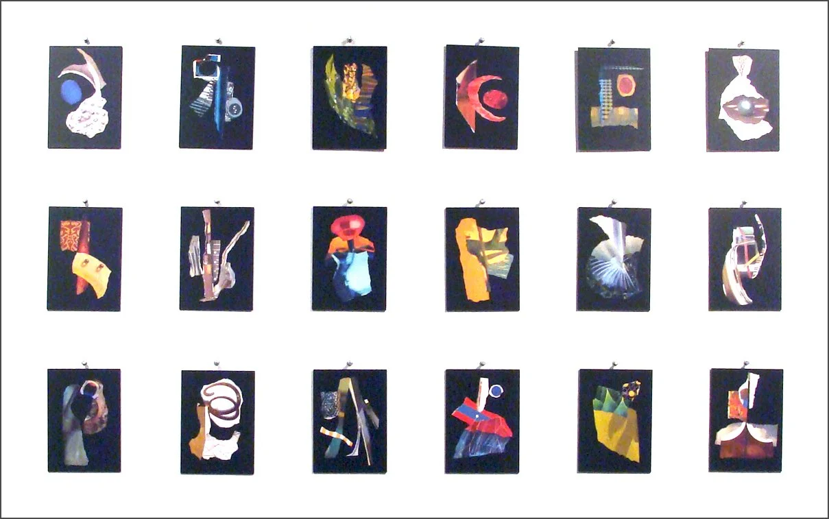
Detail from “Ruminations” installation which included 45 postcard-sized collages total.
I've also used scans from my Collage Diaries to digitally assemble Momentum, a larger compiled work.

Close-up of “Momentum,” a compilation of scans from one year of my collage diary, output as a single digital print, 4 x 6 feet..
In my current exhibition, "Do/Process," I returned to an idea that I'd drawn in my sketchbook way back in 2010! (BTW: who knew that Moleskine's sketchbooks would yellow so much?!)
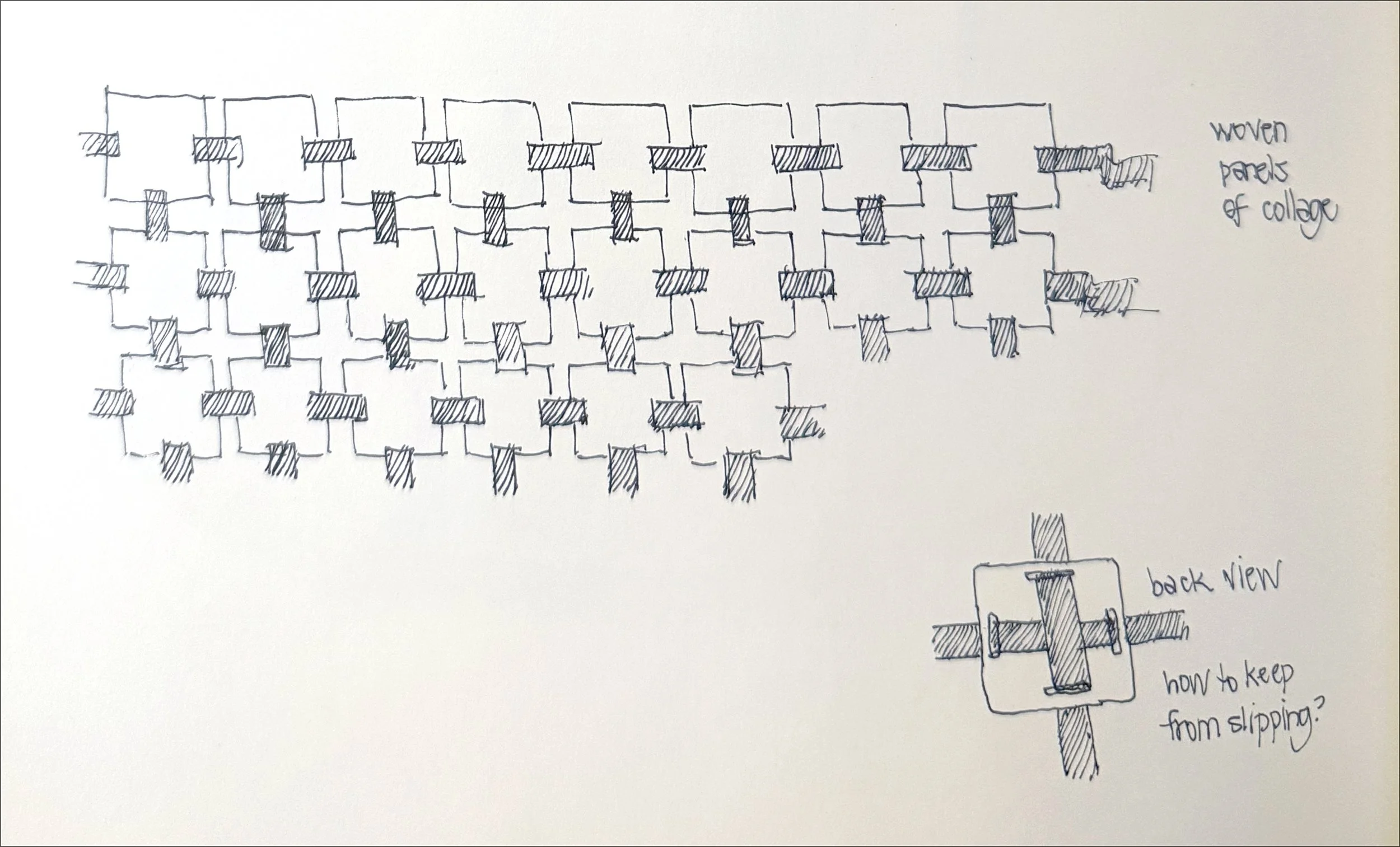
Sketchbook idea for interweaving small collages, circa 2010, finally realized in 2026!
I’d revisited the idea occasionally and finally decided to pursue the concept of weaving together a series of collages. I’ve had a life-long affinity for quilts and weaving… and hoped to make a larger piece that would have a casual, somewhat textile-like feeling to it. It’s all fiber-based after all.
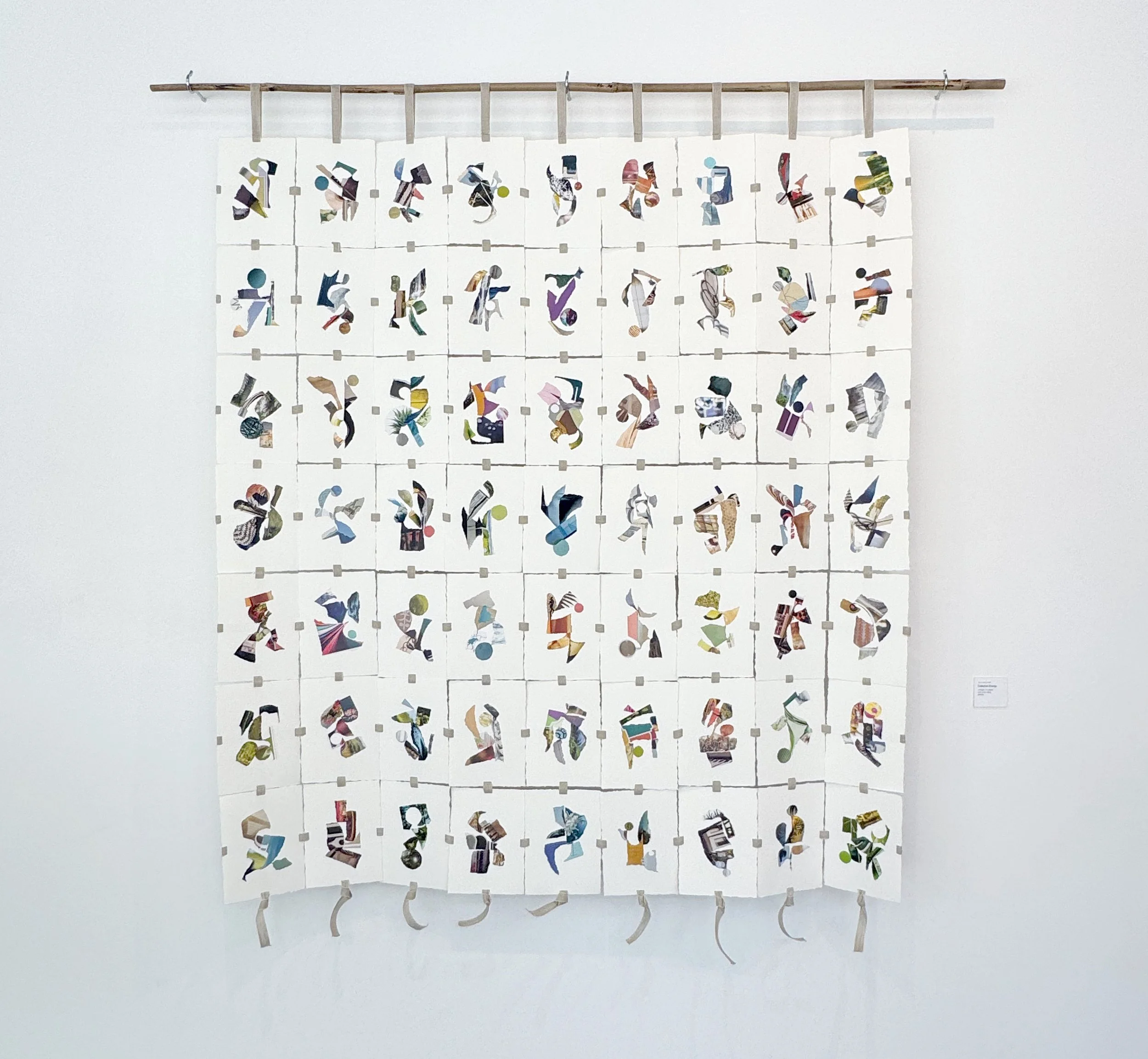
This simple structure uses ribbon or seam tape to cross behind each collage as a support. The collages were made on 7 x 5" pieces of heavy, deckle-edged watercolor paper. Then I made a slot midway along each edge. I used the slots to fasten and weave the collages together with a linen tape (not adhesive). I hoped that when it was assembled, the shadows would enhance the piece. What I hadn't imagined was how much the ventilation system in the gallery would animate the piece, That’s been fun to see.
"Collective Energy" includes 63 small abstract collages and measures roughly 49 x 45" plus the loops for hanging at top and knotted ends. I arranged the collages in my studio and hovered over them on a stepstool to photograph options to study and eventually determine the final placement.
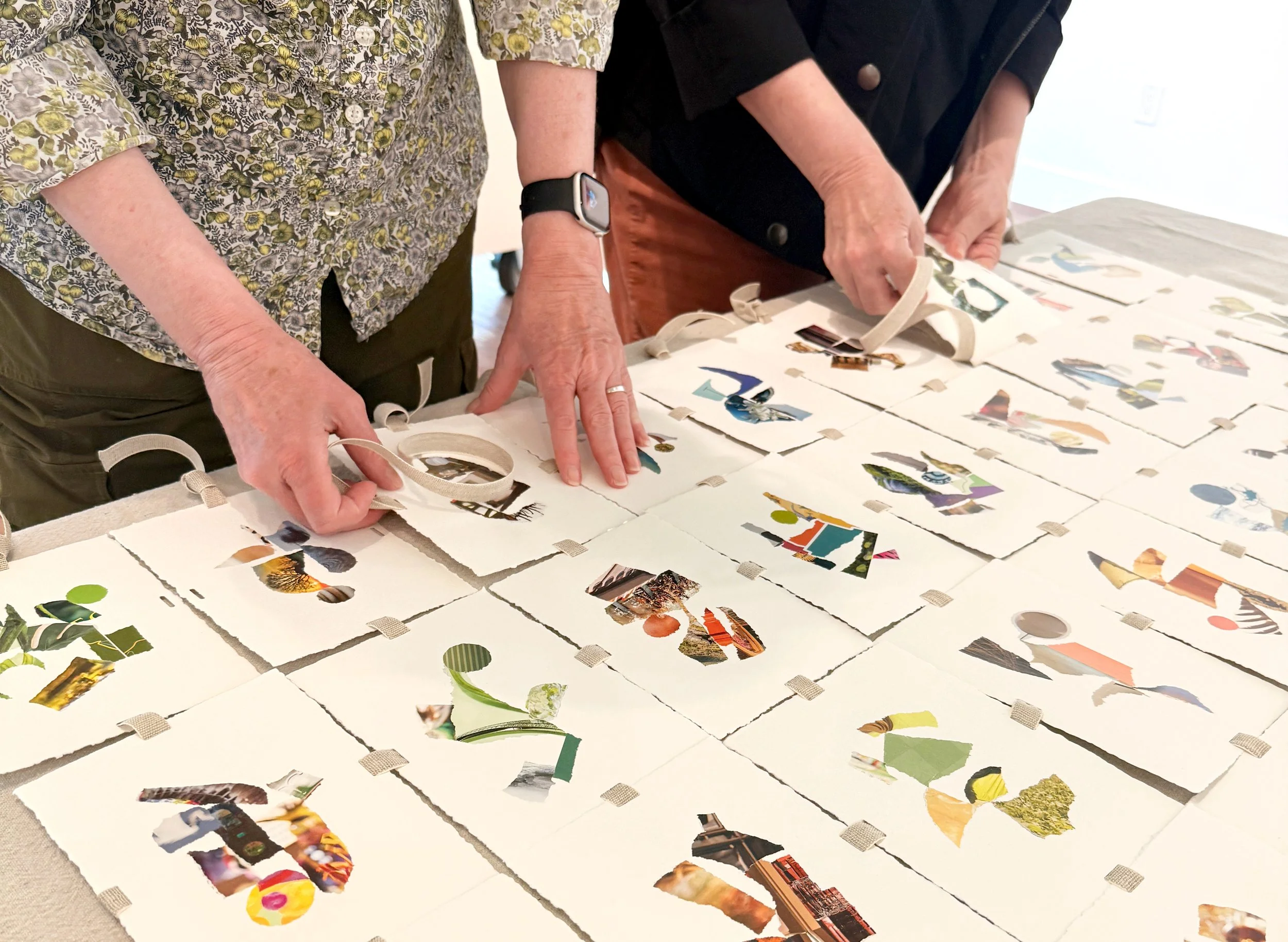
I wove the collages together at the gallery... above is a detail of weaving together the last row plus a time-lapse video of the end of the assembly process. (Big thanks to my friend, Astrid Koch, for her spirited help.)
I refer to the compositions in “Collective Energy” as glyphs and each is influenced by the moments and issues I’ve been concerned about while making them. The linking of the collages acknowledges my belief that all beings have equal value, despite our many differences. I also wanted to highlight the importance, energy and power of collective efforts.
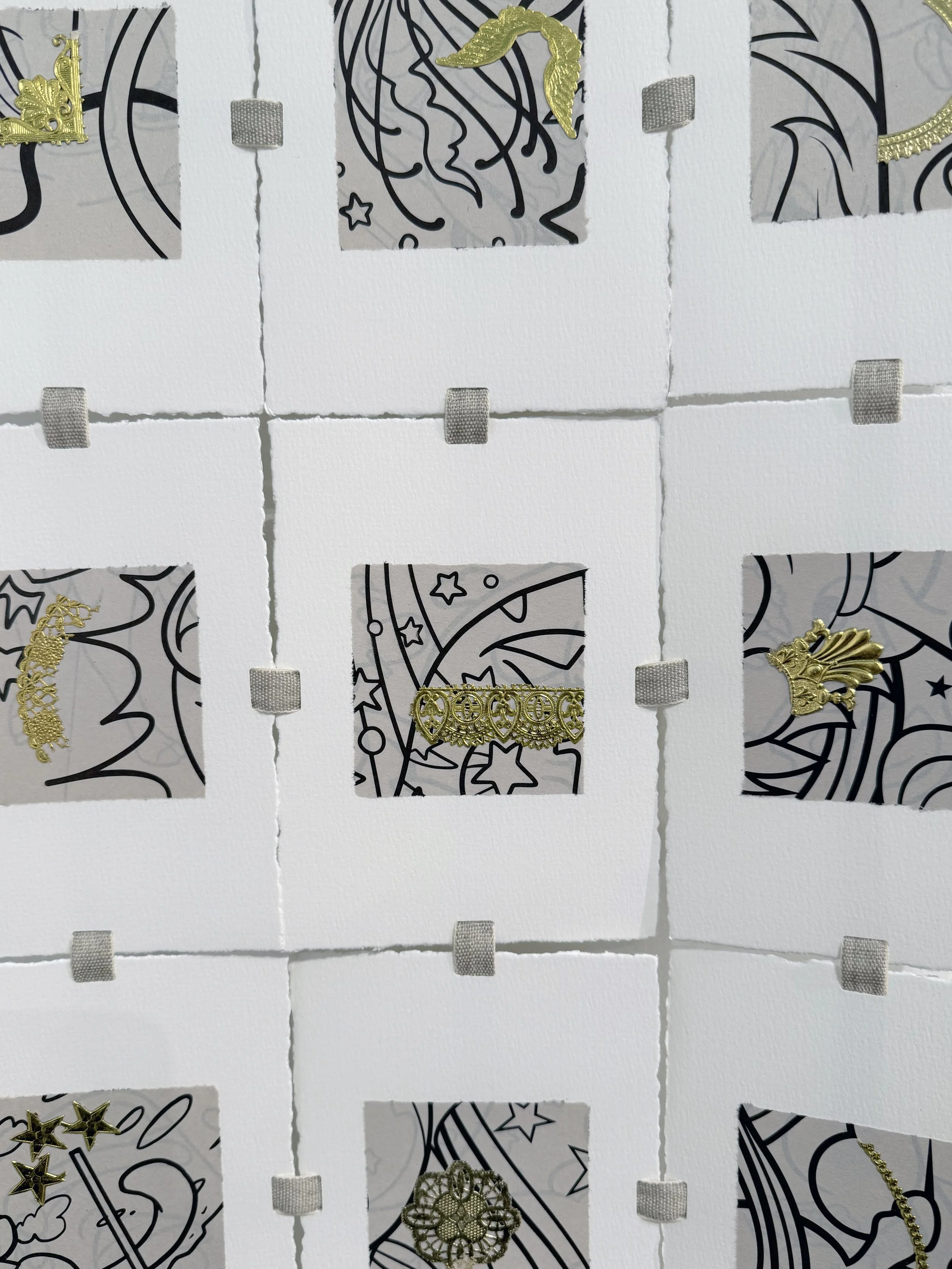
Another piece in the show that uses this same interwoven attachment method is "Gilded: It'd be funny if it weren't so absurd," my riff on the new interior decor elements in the Oval Office at the White House. The gold pieces are all sourced from my late Grandmother's card-making stash... born in 1898, she loved victorian elements and gold embellishments. I've never thrown them away and finally had a perfect use for some of her bits and pieces. The squares are cropped coloring book elements, for that important cartoon-like contrast!
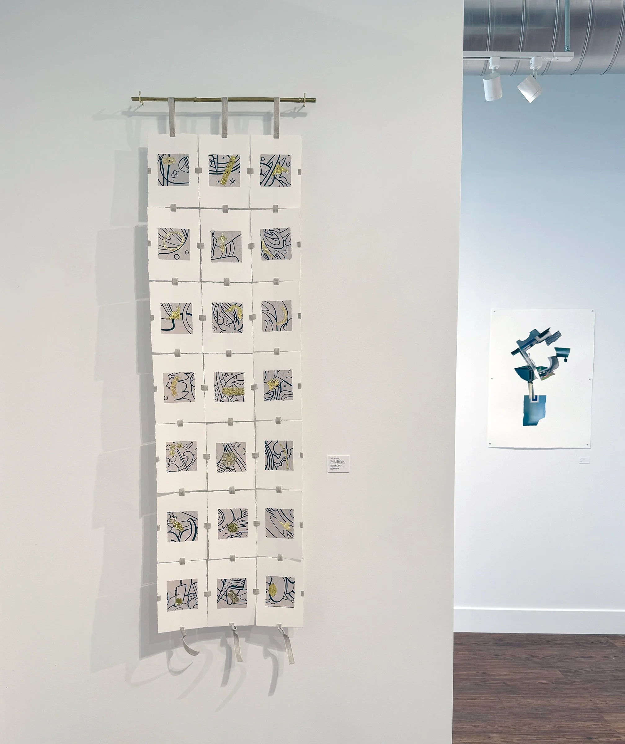
“Gilded: It’d be funny if it wasn’t so absurd,” collage with gold embellishments on watercolor paper, 49 × 15,” ©2026, Janice McDonald. In background: “Tipping Point,” collage on watercolor paper, 30 × 22,” ©2026, Janice McDonald.
I look forward to developing this interwoven format/idea further in the future. At this writing, these pieces remain available for purchase. If you’re in the Denver area, the show continues through April 21, 2026. I’d love to see you there!